Boat n' Hand
Sepia
|
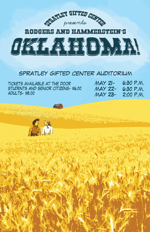
Oklahoma Poster
|
|
|
Photo Unit
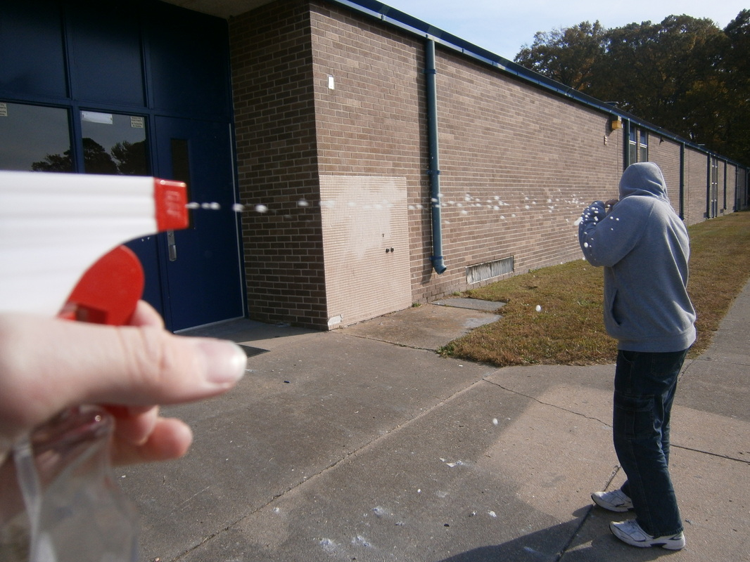
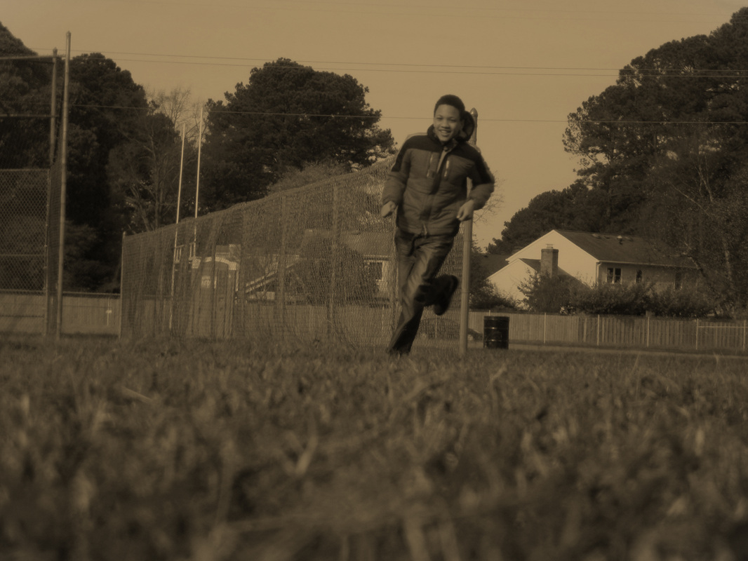
I picked these two photos because they were my favorite. I used the sepia technique for the bottom one, and the boat n' hand technique for the top. To do the sepia trick, you go to photoshop elements, and put a layer of brown over the image and select multiply for effects. For the boat n' hand, you position two images, one bigger than the other. If I become a photographer in the future I will definitely use these techniques. The main focus in the top is the water being shot at the person, and in the bottom it is the person running.
I picked these two photos because they were my favorite. I used the sepia technique for the bottom one, and the boat n' hand technique for the top. To do the sepia trick, you go to photoshop elements, and put a layer of brown over the image and select multiply for effects. For the boat n' hand, you position two images, one bigger than the other. If I become a photographer in the future I will definitely use these techniques. The main focus in the top is the water being shot at the person, and in the bottom it is the person running.
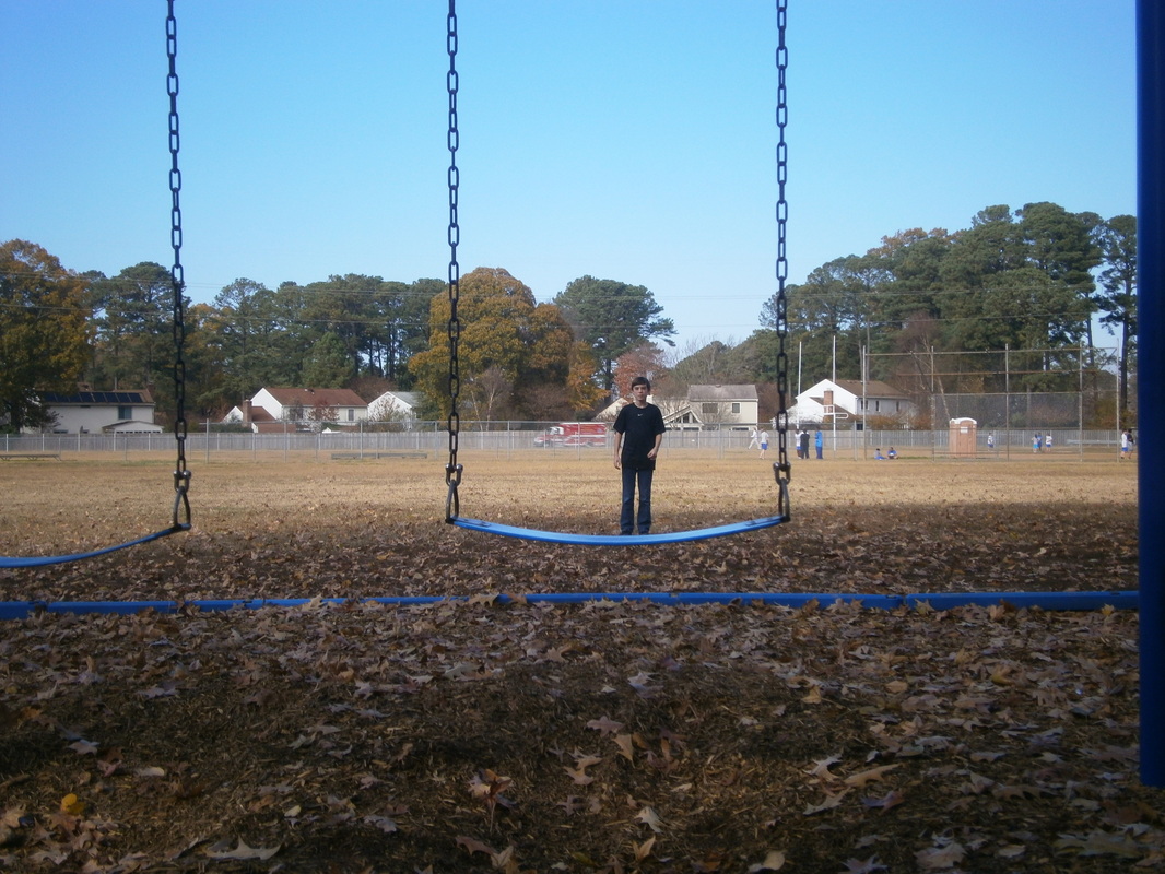
I really liked this photo because it has someone standing on a swing. But of course it is just a boat n' hand. Its visually interesting because it has a tiny person on a swing
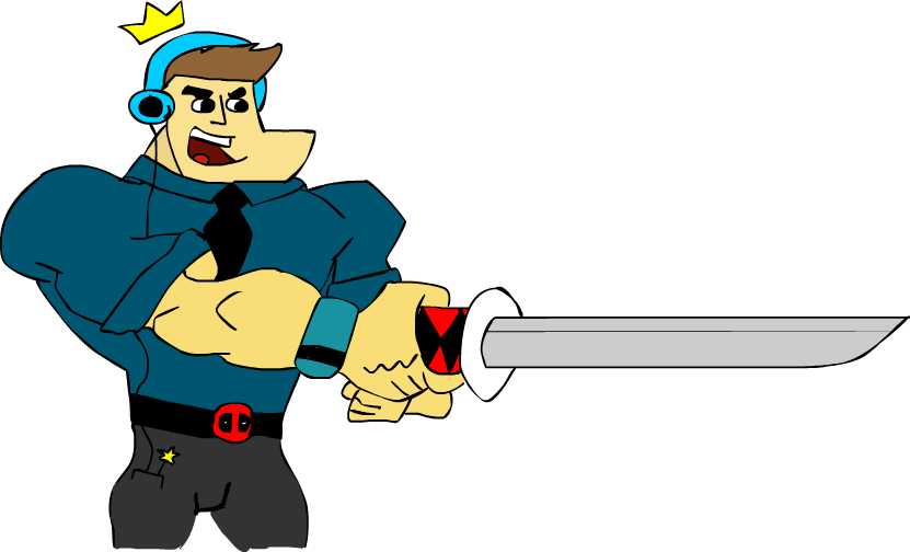
FontBot
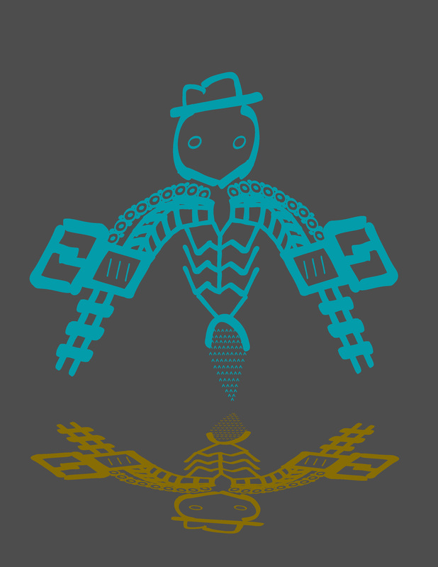
There are a ton of different units in this fontbot, like the arms are hashtags, and a lot of l's. Also in the head there were ()'s. This project actually was hard and easy, because I had cool ideas, but it took me a while to execute the ideas. If this Fontbot actually came to life, I would most likely find it in a police station as a detective, or in the army. I thought the blue, grey, and gold really worked together and looked good, but I did not think it effected my feelings toward the art though.
Montage
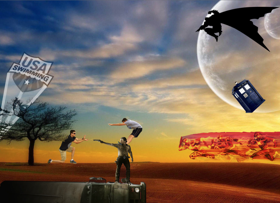
For this montage, the process I used, went like this… I first got a background that I liked with a good resolution. Then I went on the internet and got pictures from what I like, and what I like to do. Finally I put them in a way that suited me and played around with different techniques. The five pictures to represent me, were the TARDIS, the Batman silhouette, the USA Swimming logo (as the Batman Signal), the Flash and Rick from The Walking Dead. I choose these mainly because it had to do with what I like and what I like to do. The final image was taken of my brother, Parker (on the right), and me (on the left). We were at the grand canyon and we had to get in the exact position and I had to jump. I think the most emphasized element/principle of art was movement/rhythm.
Computer Drawing
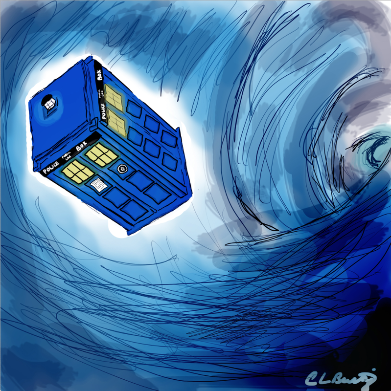
For this digital drawing I used a Walcom tablet on Photoshop CS6. I used many different layers to set up the lines, colors, and background. I drew the TARDIS flying in the Time Vortex, (if you couldn't tell) mainly because I love Doctor Who, and I think it is a cool concept. The main element that I feel is the most important, is line as it gives the overall look of the Time Vortex. Though color would also be a main element in this drawing.
For this digital drawing I used a Walcom tablet on Photoshop CS6. I used many different layers to set up the lines, colors, and background. I drew the TARDIS flying in the Time Vortex, (if you couldn't tell) mainly because I love Doctor Who, and I think it is a cool concept. The main element that I feel is the most important, is line as it gives the overall look of the Time Vortex. Though color would also be a main element in this drawing.
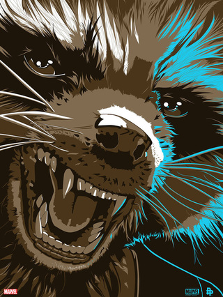
This is a pretty cool image of one of my favorite superheroes, Rocket Raccoon. I really like the use of the shading, and how much they did with only a few colors.
